All examples use the bundled patient_disposition data, a
simulated disposition table for 20 trial participants.
patient_disposition
#> # A tibble: 20 × 7
#>    subject weeks_on_study cohort   reason_off_study  prior_drug partial_response
#>    <chr>            <dbl> <chr>    <chr>             <chr>                 <dbl>
#>  1 339057          70.3   Cohort A Physician decisi… Yes                   35.7
#>  2 751377          31.2   Cohort B Withdrawal by su… No                    NA
#>  3 297647          42.6   Cohort B Disease progress… Yes                   NA
#>  4 992253          22.8   Cohort A Adverse event     Yes                   NA
#>  5 542555          64.9   Cohort A Disease progress… Yes                   NA
#>  6 980129          15.0   Cohort B Withdrawal by su… Yes                   10.8
#>  7 321235          64.7   Cohort B Adverse event     No                    NA
#>  8 223561          27.5   Cohort B Physician decisi… Yes                   26.1
#>  9 494306          87.6   Cohort A NA                Yes                    8.26
#> 10 460588          79.6   Cohort B NA                Yes                   NA
#> 11 482665          94.2   Cohort A Completed         No                    NA
#> 12 361221          78.7   Cohort B Completed         Yes                   60.2
#> 13 690585          72.2   Cohort A Adverse event     Yes                   52.2
#> 14 337310          86.5   Cohort A Completed         No                    NA
#> 15 986548          26.9   Cohort B Withdrawal by su… No                    NA
#> 16 158396           0.186 Cohort A Adverse event     Yes                   NA
#> 17 828351          40.9   Cohort A Disease progress… Yes                    8.82
#> 18 226603          74.4   Cohort B Disease progress… No                    NA
#> 19 467205          52.5   Cohort A Disease progress… Yes                   44.6
#> 20 465452          86.4   Cohort A NA                No                    67.3
#> # ℹ 1 more variable: weeks_on_treatment <dbl>
A basic swimlane
geom_swimlane() draws one bar per subject.
order_swimlane() relevels the subject column first so lanes
run shortest to longest, and theme_swimlane() supplies the
finished look. Time axes read best with breaks at protocol-meaningful
intervals, so every example here sets 12-week breaks rather than
accepting the ggplot2 defaults:
patient_disposition |>
  order_swimlane(subject, weeks_on_study) |>
  ggplot() +
  geom_swimlane(subject, weeks_on_study) +
  scale_x_continuous(breaks = scales::breaks_width(12)) +
  labs(x = "Weeks on study") +
  theme_swimlane()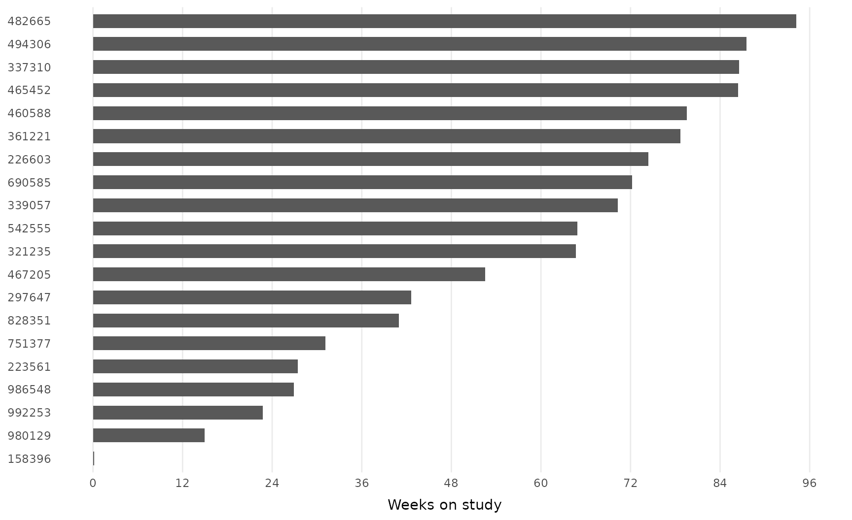
Add a fill variable to color lanes by cohort; pass the same variable
to order_swimlane() to group the lanes:
patient_disposition |>
  order_swimlane(subject, weeks_on_study, cohort) |>
  ggplot() +
  geom_swimlane(subject, weeks_on_study, cohort) +
  scale_x_continuous(breaks = scales::breaks_width(12)) +
  labs(x = "Weeks on study") +
  theme_swimlane()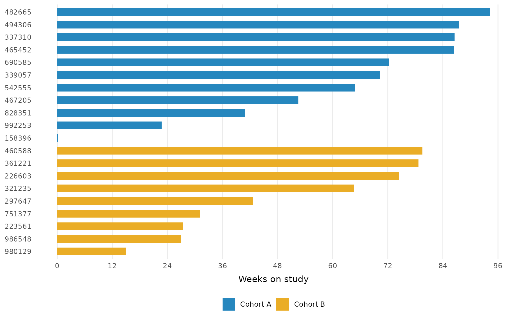
Annotating lanes
Three layers mark events along each lane, and each generates its legend entry automatically:
-
geom_swimlane_status()marks the end of each lane with the subject’s status; subjects still on study (NAstatus) get a rightward arrow. -
geom_swimlane_marker()marks on-lane events such as responses. -
geom_swimlane_rug()flags baseline characteristics in the left margin.
patient_disposition |>
  mutate(
    prior_drug = if_else(prior_drug == "Yes", "Prior therapy", NA)
  ) |>
  order_swimlane(subject, weeks_on_study, cohort) |>
  ggplot() +
  geom_swimlane(subject, weeks_on_study, cohort) +
  geom_swimlane_status(subject, weeks_on_study, reason_off_study) +
  geom_swimlane_marker(
    subject, partial_response,
    marker_label = "Partial response"
  ) +
  geom_swimlane_rug(subject, prior_drug) +
  scale_x_continuous(breaks = scales::breaks_width(12)) +
  labs(title = "Time on study by subject", x = "Weeks on study") +
  theme_swimlane()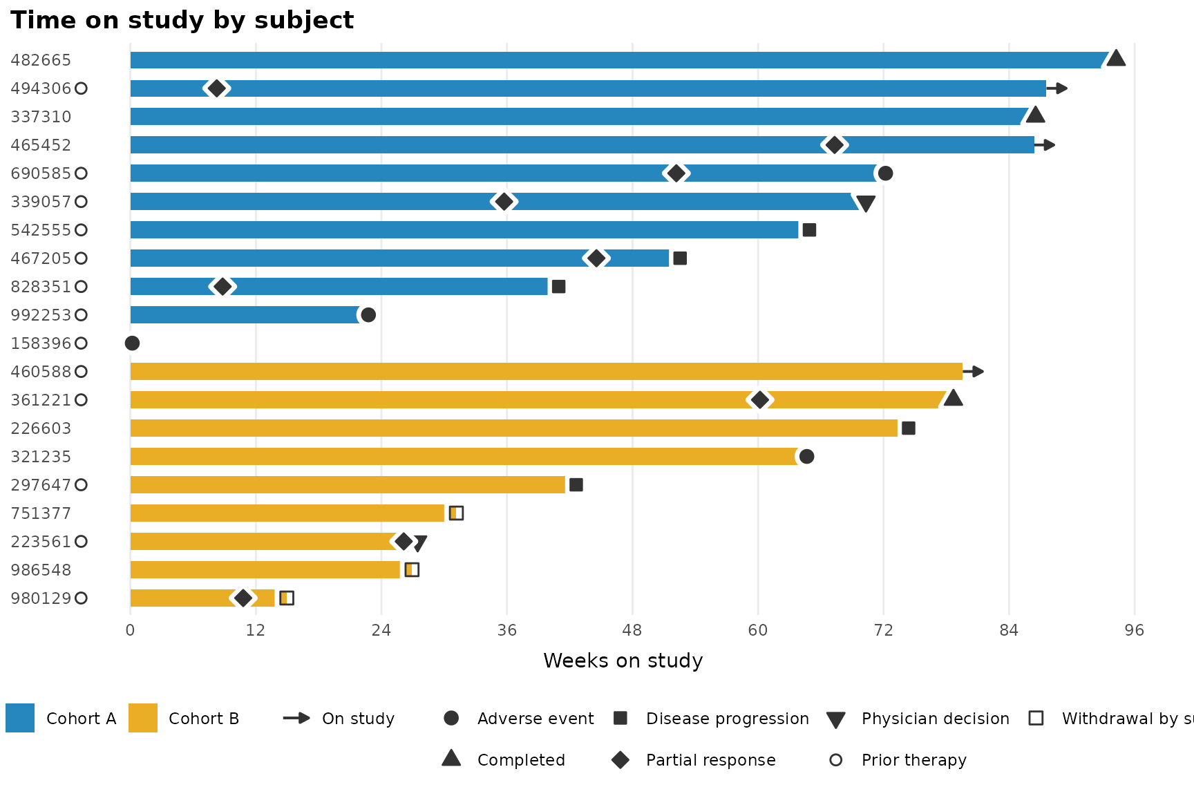
Two-color bars: stacked segments
With one row per subject and phase, bar segments stack in
factor-level order. Here each lane splits into treatment and follow-up
phases; note that order_swimlane() runs before pivoting so
lanes stay ordered by total duration.
Shapes assign in factor-level order, so a plot with different status
levels would reshuffle them: this plot has no partial responses, and
“Physician decision” would silently inherit the diamond that meant
“Partial response” above. When a document has several swimlanes, pin
each status to its shape with a named values vector:
status_shapes <- c(
  "Adverse event" = 21,
  "Completed" = 24,
  "Disease progression" = 22,
  "Partial response" = 23,
  "Physician decision" = 25,
  "Prior therapy" = 1,
  "Withdrawal by subject" = 0
)

patient_disposition |>
  order_swimlane(subject, weeks_on_study, cohort) |>
  mutate(
    Treatment = weeks_on_treatment,
    `Follow-up` = weeks_on_study - weeks_on_treatment
  ) |>
  tidyr::pivot_longer(
    c(Treatment, `Follow-up`),
    names_to = "phase", values_to = "weeks"
  ) |>
  mutate(phase = factor(phase, levels = c("Treatment", "Follow-up"))) |>
  ggplot() +
  geom_swimlane(subject, weeks, phase) +
  geom_swimlane_status(subject, weeks_on_study, reason_off_study) +
  scale_shape_swimlane(
    values = status_shapes,
    guide = guide_legend(order = 3, nrow = 2)
  ) +
  scale_x_continuous(breaks = scales::breaks_width(12)) +
  labs(title = "Treatment and follow-up phases", x = "Weeks on study") +
  theme_swimlane()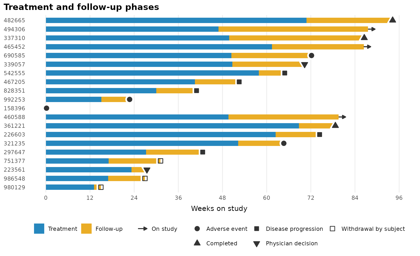
Text annotations
Prefer text over symbols? geom_swimlane_label() writes
each status past the end of its bar. Subjects with NA are
skipped, which would leave ongoing subjects indistinguishable from
missing data, so recode them to a label first. Widen the right margin to
make room:
patient_disposition |>
  mutate(reason_off_study = coalesce(reason_off_study, "On study")) |>
  order_swimlane(subject, weeks_on_study, cohort) |>
  ggplot() +
  geom_swimlane(subject, weeks_on_study, cohort) +
  geom_swimlane_label(subject, weeks_on_study, reason_off_study) +
  scale_x_continuous(breaks = scales::breaks_width(12)) +
  labs(x = "Weeks on study") +
  theme_swimlane(extra_margin_r = 60)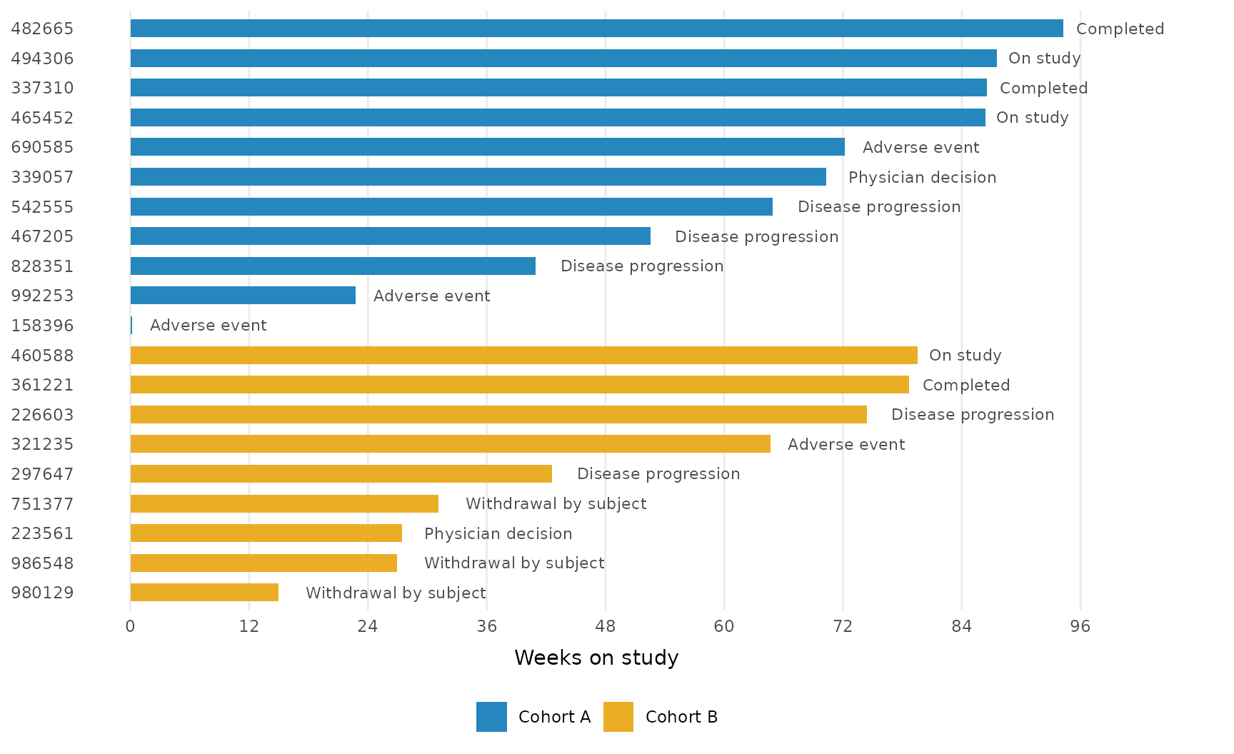
Customization
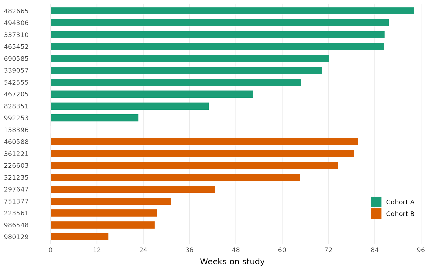
The built-in scales step aside for any discrete scale you add
(ggplot2 prints a message when a scale is replaced). Theme settings pass
through theme_swimlane(), including an inside legend:
patient_disposition |>
  order_swimlane(subject, weeks_on_study, cohort) |>
  ggplot() +
  geom_swimlane(subject, weeks_on_study, cohort) +
  scale_fill_brewer(palette = "Dark2") +
  scale_x_continuous(breaks = scales::breaks_width(12)) +
  labs(x = "Weeks on study") +
  theme_swimlane(
    base_size = 12,
    legend.position = "inside",
    legend.position.inside = c(0.9, 0.15)
  )
Fonts
theme_swimlane() deliberately sets no font family, so
plots use your graphics device’s default and render the same everywhere.
To use a house font, pass any installed font’s name as
base_family:
patient_disposition |>
  order_swimlane(subject, weeks_on_study, cohort) |>
  ggplot() +
  geom_swimlane(subject, weeks_on_study, cohort) +
  scale_x_continuous(breaks = scales::breaks_width(12)) +
  labs(x = "Weeks on study") +
  theme_swimlane(base_family = "Atkinson Hyperlegible")
Font lookup depends on the graphics device. The ragg devices resolve any font
installed on your system by name; in R Markdown or Quarto, set the chunk
option dev = "ragg_png". The base pdf() device
only knows a handful of built-in typefaces, so for PDF output use
dev = "cairo_pdf" instead.