Introduction
A DuckLake keeps detailed records about itself: every change to a table is a snapshot, every changed row is in the change feed, and every Parquet file is tracked in the catalog. All of that comes back to R as data frames, but past a handful of rows a picture is easier to scan. This vignette walks through the package’s three plotting functions and its interactive viewer:
-
plot_snapshots()draws a table’s history as a commit-log style timeline -
plot_table_changes()shows how many rows each snapshot changed -
view_table_changes()opens the changed rows themselves in an interactive viewer -
plot_table_files()shows how each table’s data is laid out on disk
The plots need the ggplot2 package and the viewer needs htmlwidgets; ducklake suggests both but requires neither.
Building Some History
We’ll create a small lake and put a table through a few changes, recording authors and commit messages along the way.
attach_ducklake(
  ducklake_name = "lake_viz_demo",
  lake_path = vignette_temp_dir,
  author = "Data Engineer"
)

fleet <- tibble(
  car_id = 1:5,
  model = c("Corolla", "Civic", "Model 3", "F-150", "Outback"),
  mileage = c(42000, 38000, 12000, 67000, 55000)
)

with_transaction(
  create_table(fleet, "fleet"),
  author = "Data Engineer",
  commit_message = "Initial fleet load"
)
#> Committed snapshot 1 (Data Engineer): Initial fleet load
Now a couple of routine updates:
new_cars <- tibble(
  car_id = 6:7,
  model = c("CX-5", "Ioniq 5"),
  mileage = c(21000, 8000)
)

with_transaction(
  rows_insert(get_ducklake_table("fleet"), new_cars, by = "car_id"),
  author = "Fleet Manager",
  commit_message = "Add March arrivals"
)
#> Committed snapshot 2 (Fleet Manager): Add March arrivals

serviced <- tibble(
  car_id = c(1, 3, 5),
  mileage = c(42750, 13400, 55900)
)

with_transaction(
  rows_update(get_ducklake_table("fleet"), serviced, by = "car_id"),
  author = "Fleet Manager",
  commit_message = "Record spring odometer readings"
)
#> Committed snapshot 3 (Fleet Manager): Record spring odometer readings

sold <- tibble(car_id = 4L)

with_transaction(
  rows_delete(get_ducklake_table("fleet"), sold, by = "car_id"),
  author = "Fleet Manager",
  commit_message = "Remove sold F-150"
)
#> Committed snapshot 4 (Fleet Manager): Remove sold F-150
The audit trail so far:
list_table_snapshots("fleet") |>
  select(snapshot_id, snapshot_time, author, commit_message)
#>   snapshot_id       snapshot_time        author                  commit_message
#> 1           1 2026-09-17 21:44:24 Data Engineer              Initial fleet load
#> 2           2 2026-09-17 21:44:24 Fleet Manager              Add March arrivals
#> 3           3 2026-09-17 21:44:25 Fleet Manager Record spring odometer readings
#> 4           4 2026-09-17 21:44:25 Fleet Manager               Remove sold F-150
Plotting the Timeline
plot_snapshots() turns that data frame into a
picture:
plot_snapshots("fleet")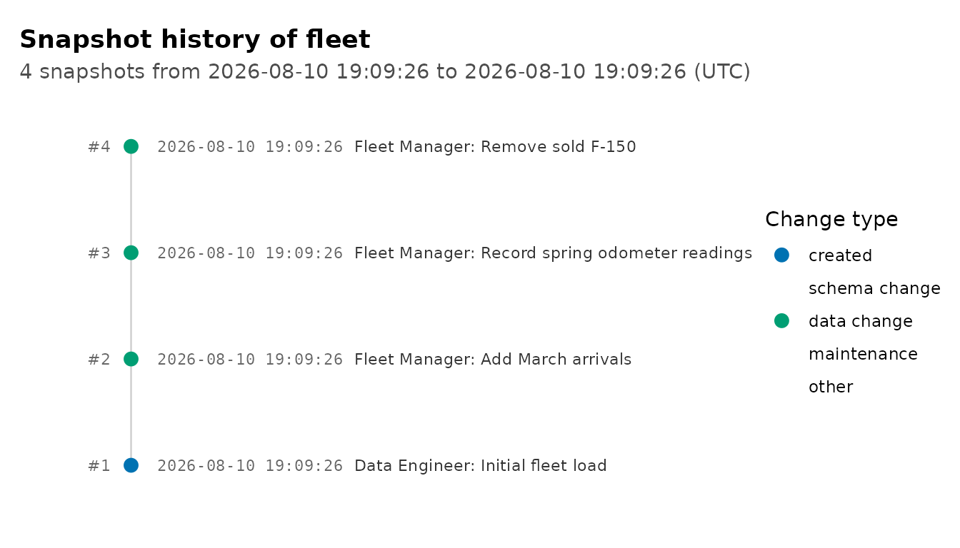
Reading it like a git log: the newest snapshot is at the top, each row shows the snapshot’s timestamp, author, and commit message, and the color shows whether the snapshot created the table, changed data, changed the schema, or was maintenance activity (like flushing inlined data or compacting files). Snapshots are spaced evenly by order rather than by clock time, so a table that sat untouched for months stays readable: a long idle stretch shows up as an inline marker (like “103 days later”) instead of stretching the whole plot.
How Much Changed
The timeline shows when changes happened and what kind they were;
plot_table_changes() shows how big each one was. It counts
the rows each snapshot touched using DuckLake’s change feed (the same
data get_table_changes() returns) and draws them as
diverging bars: rows inserted or updated above the axis, rows deleted
below it.
plot_table_changes("fleet")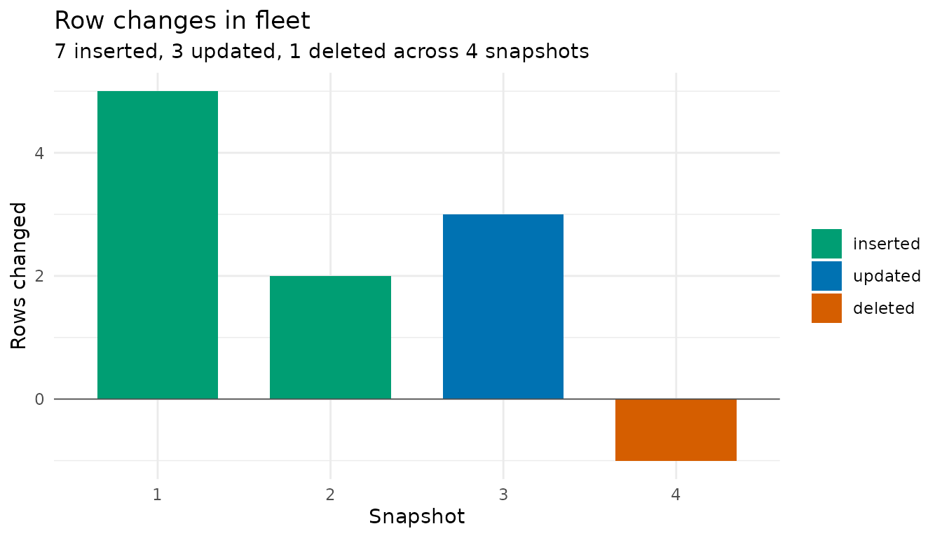
Browsing the Changes
plot_table_changes() counts the rows;
view_table_changes() shows them. It takes the change feed
from get_table_changes() and opens it in an interactive
viewer. The sidebar lists the snapshots in range, each with its author
and message, the columns that changed, and the rows inserted, updated,
and deleted; the main panel shows whichever part you pick. An update is
one row, shown from its old or its new side, with the changed cells
highlighted and both values on hover.
view_table_changes(get_table_changes("fleet"))The feed is a lazy table, so dplyr verbs narrow it before anything is collected. One car’s history:
get_table_changes("fleet") |>
  filter(car_id == 3) |>
  view_table_changes()
A filter on a column whose value changed, like mileage,
matches one image of an update and not the other; the viewer marks such
rows as one-sided. Filters on car_id,
snapshot_id, rowid, or
change_type keep pairs whole. The layout follows Hadley
Wickham’s data-diff.
How the Data Is Stored
Behind the scenes, table data lives in Parquet files (very small
writes may be inlined into the catalog until they are flushed out). To
make the storage view interesting, let’s add a larger table alongside
fleet and grow it in two batches, so it ends up with two
data files:
set.seed(42)

telemetry <- tibble(
  reading_id = 1:5000,
  car_id = sample(1:7, 5000, replace = TRUE),
  speed = round(runif(5000, 0, 80)),
  fuel = round(runif(5000, 0, 100))
)

create_table(telemetry, "telemetry")

more_readings <- tibble(
  reading_id = 5001:10000,
  car_id = sample(1:7, 5000, replace = TRUE),
  speed = round(runif(5000, 0, 80)),
  fuel = round(runif(5000, 0, 100))
)

rows_insert(get_ducklake_table("telemetry"), more_readings, by = "reading_id")
The fleet table’s handful of rows were small enough to be inlined, so we flush them into a Parquet file to make them visible to the storage statistics:
flush_inlined_data()
#> Flushed 10 rows from 1 table to Parquet.
#>   schema_name table_name rows_flushed
#> 1        main      fleet           10
get_table_info() reports each table’s file count and
size:
get_table_info()
#>   table_name schema_id table_id                           table_uuid file_count
#> 1      fleet         0        1 01a0b153-f5ee-7db1-aa75-b68971e82eb7          1
#> 2  telemetry         0        2 01a0b153-fb9a-7919-aa7f-4888e93ce08c          2
#>   file_size_bytes delete_file_count delete_file_size_bytes schema_name
#> 1            1027                 1                   1120        main
#> 2           65518                 0                      0        main
And plot_table_files() draws it, with delete files (rows
removed but not yet compacted away) stacked in a second color:
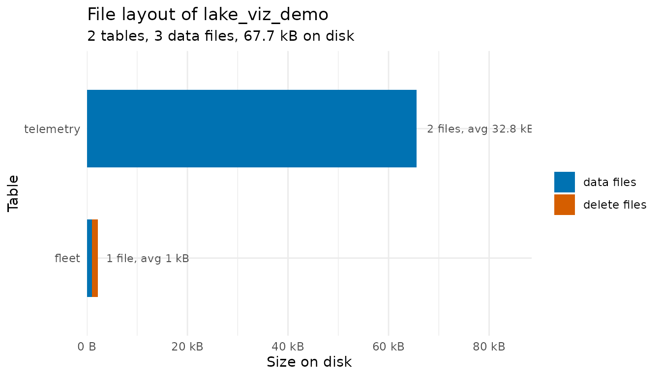
This is the picture to watch as a lake ages: many small files or a
growing delete-file share mean it is time for the compaction tools
covered in vignette("storage-and-backups"), like
merge_adjacent_files() and
rewrite_data_files().
Plotting the Whole Lake
With two tables in the lake, we can step back and look at everything
at once. Calling plot_snapshots() without a table name
switches to a swimlane view: one row per table, one point per snapshot,
with recently active tables at the top. Where the single-table timeline
shows what happened to one table, the swimlane shows which tables are
active and what kind of churn each one sees:
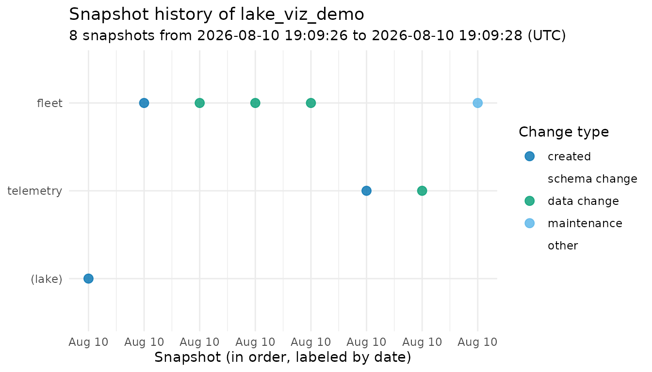
Snapshots that don’t belong to any table, like the initial schema
creation, appear in a (lake) lane. As in the timeline,
points are spaced by order rather than clock time; the x axis labels
show each snapshot’s date.
Customizing the Plots
Each function returns a regular ggplot object, so you can restyle it
like any other plot. (The single-table timeline draws on a blank canvas,
so it is best customized with labs() and
theme() tweaks rather than a full theme swap like
theme_classic(), which would bring back axes that have no
meaning there.)
plot_snapshots("fleet") +
  ggplot2::labs(title = "Fleet table audit trail")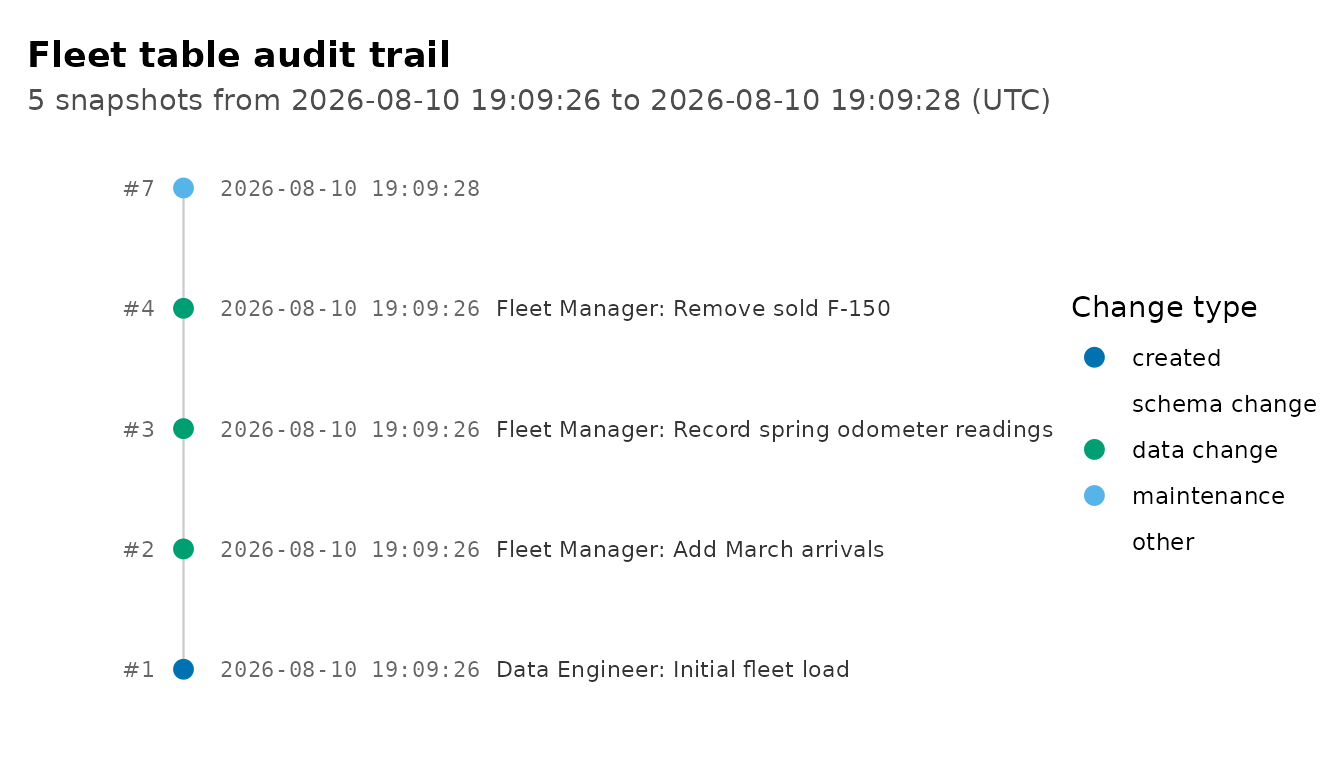
Learn More
-
vignette("time-travel")covers querying and restoring the historical versions these snapshots represent -
vignette("transactions")covers recording authors and commit messages withwith_transaction()andcommit_transaction() -
vignette("storage-and-backups")covers the maintenance functions that keep the file layout healthy