
Plot the rows changed in each snapshot of a table
Source:R/plot_table_changes.R
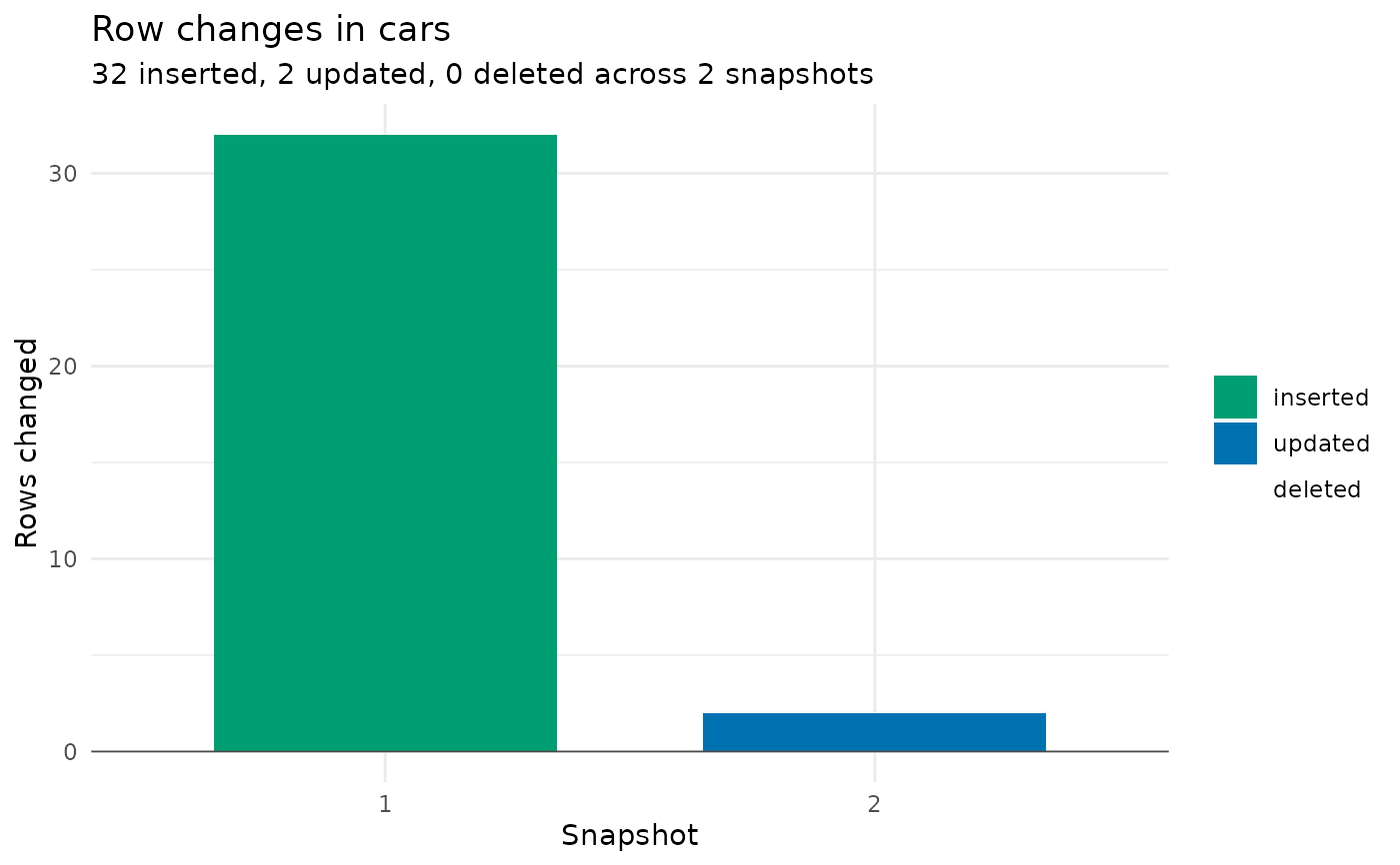
plot_table_changes.RdDraws a table's change volume as a diverging bar chart: one bar per
snapshot, with rows inserted or updated above the axis and rows deleted
below it. A companion to plot_snapshots(), which shows when and what
kind of changes happened; this shows how much changed each time.
Details
Requires the ggplot2 package (listed in Suggests). Row counts come from
DuckLake's data change feed via get_table_changes(). An update appears
in the feed as a before and an after image of the row; it is counted once
here. Snapshots that touched the table without changing rows (a schema
change, for example) keep their slot on the axis with no bar.
Examples
lake_dir <- tempfile("plotchg_lake_")
dir.create(lake_dir)
attach_ducklake("plotchg_lake", lake_path = lake_dir)
create_table(mtcars, "cars")
rows_update(
get_ducklake_table("cars"),
data.frame(mpg = 21, gear = 5),
by = "mpg"
)
# Rows inserted, updated, and deleted per snapshot
plot_table_changes("cars")
 # Customize the result like any ggplot
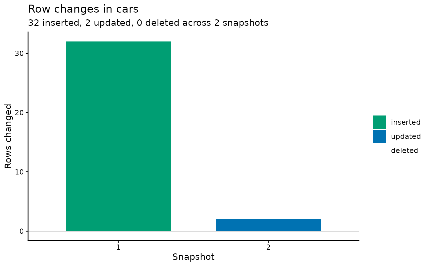
plot_table_changes("cars") +
ggplot2::theme_classic()
# Customize the result like any ggplot
plot_table_changes("cars") +
ggplot2::theme_classic()
 detach_ducklake("plotchg_lake", shutdown = TRUE)
unlink(lake_dir, recursive = TRUE)
detach_ducklake("plotchg_lake", shutdown = TRUE)
unlink(lake_dir, recursive = TRUE)